The West Centre, Glasgow
Learn how an innovative art and design strategy made a health and social care centre for children feel welcoming and non-clinical.

What do tiny figurines inside walls and children’s healthcare have in common? Answer: an award-winning medical and social support centre in Glasgow.
The West Centre was built as a ‘one stop shop’ for medical and social support services for families and children with ongoing medical issues. It opened in 2010 and serves west Glasgow and the wider area.
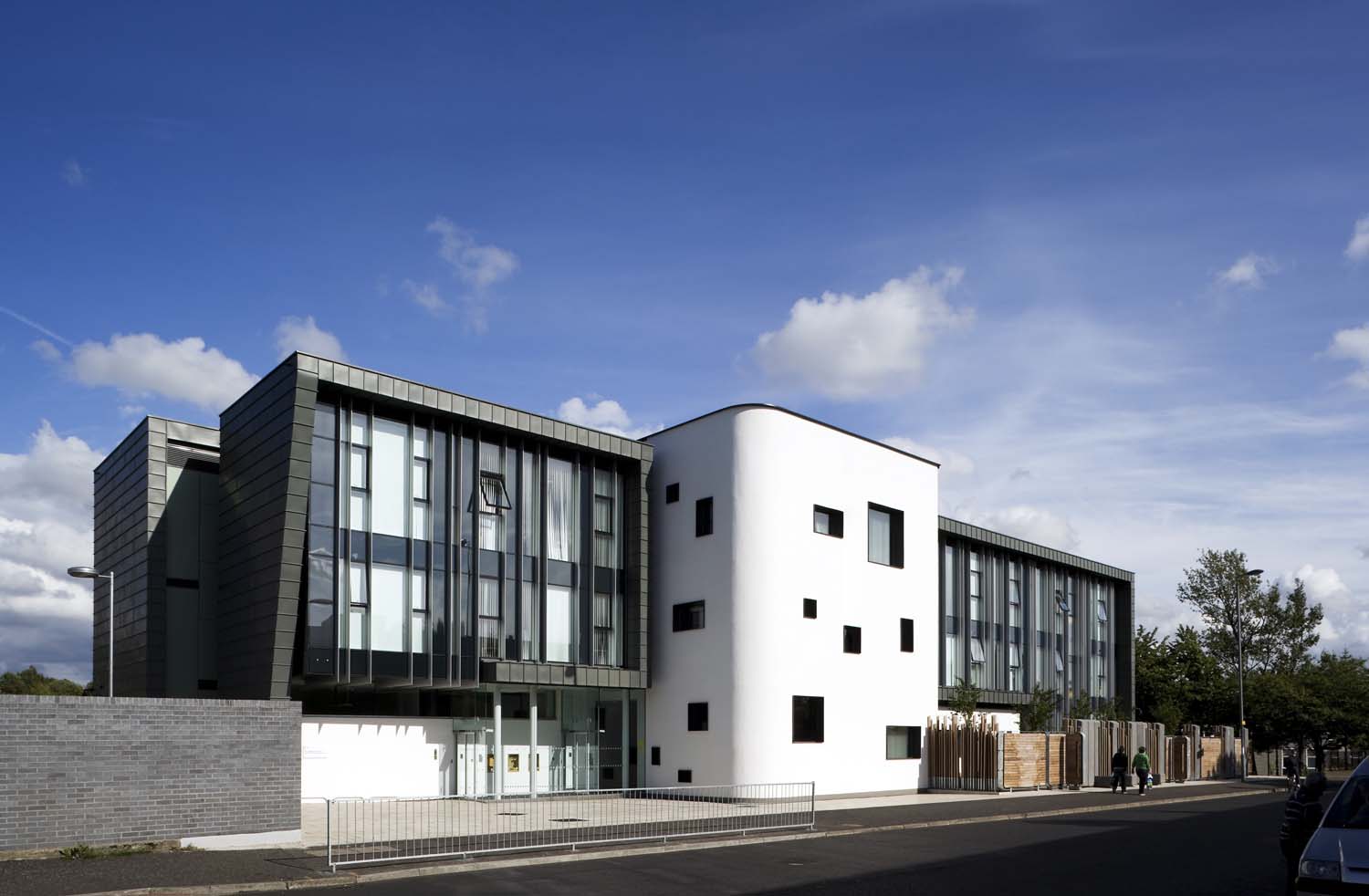
The core aim of the building’s design was to make it feel welcoming, rather than clinical. Installed throughout the building are playful and interactive art installations, and it is light, spacious and friendly.
The building has been awarded and shortlisted for several awards in both healthcare and broader architecture categories.
Art strategy
The aim behind the strategy was two-fold:
-
To make the facility feel welcoming and non-clinical
-
To address the fact that most children who visit the centre will do so repeatedly
Art is scattered throughout corridors and stairwells. This allows children and adults to engage directly with the artwork.
Much of the art is deliberately hard to spot: the building is designed to be explored so things can be discovered over time.

The centre’s art includes:
-
a series of peepholes set into the walls: children peer into minute scenes where tiny figures inhabit the walls, skiing down pipes and climbing electrical wires
-
a harp set into a handrail, which can be played by running your fingers across as you climb
-
an interactive wall art for children to play with
-
a large glass window above the waiting area inscribed with phrases from children’s books
Image credit: Jo Hanley
“It’s fantastic – exactly what we wanted. Even now, children who’ve visited time and time again suddenly see something in the wall.”

Non-institutional atmosphere
The building is bright and airy, with high ceilings and doorways. This makes the rooms feel spacious, welcoming and non-institutional.
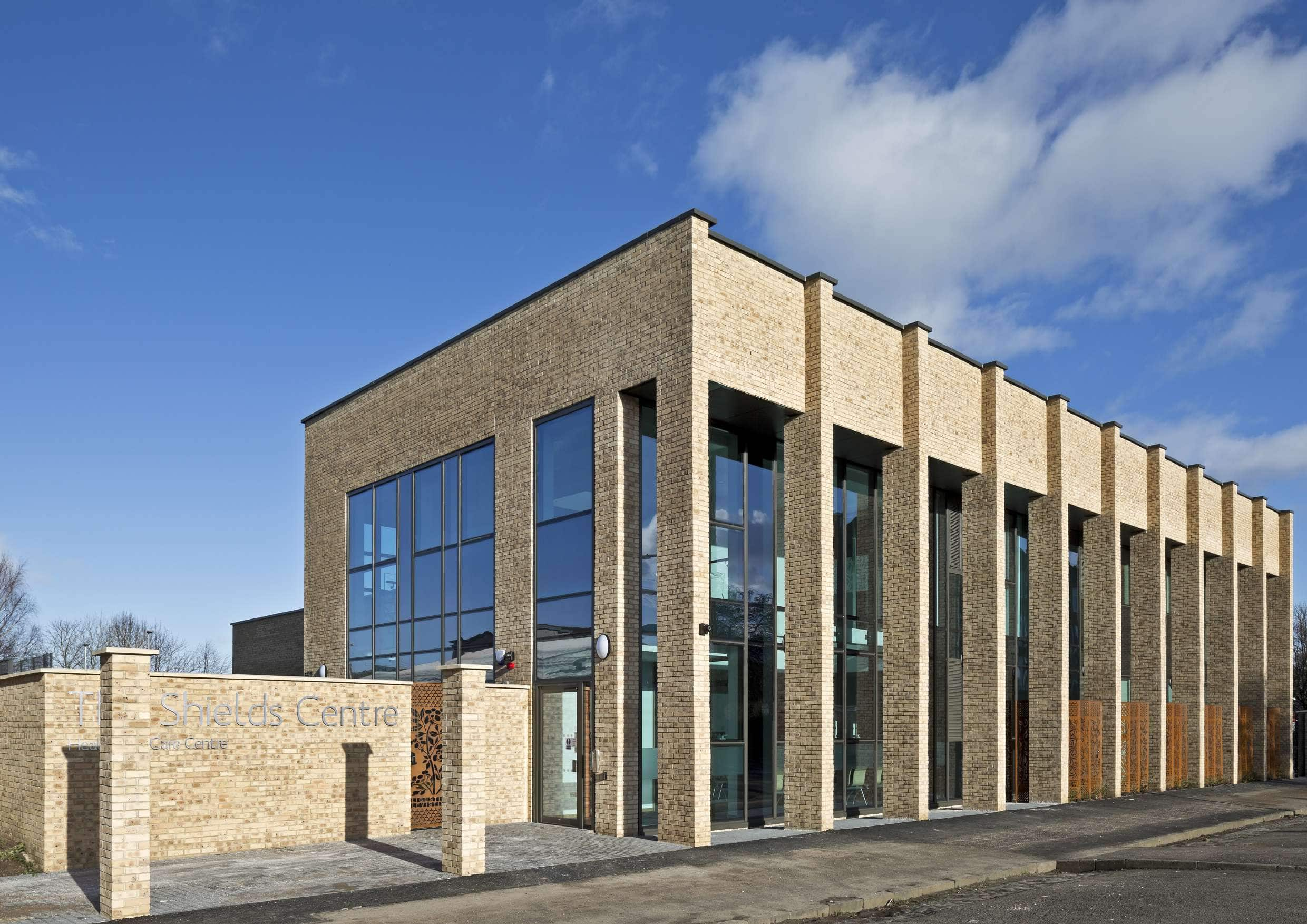
The interior finishes, no more expensive or less durable than usual, also help to give the building a less clinical feel. The exterior finishes are quite urban to give the building a civic and important feel.
Areas such as those used by the mental health service are linked visually through glazed doors. This allows them to be secure without feeling shut off or confined.
Image credit: Keith Hunter Photography
Wayfinding
The centre has a simple, clear plan, which enables easy movement throughout and rooms to have views of trees outside. Views out to Drumchapel also reinforce connection with the community.
At no point as you move around the centre do you lose sight of the atrium or the environment outside – you can always tell where you are.
While there are a range of services on offer, there is only one reception desk. This makes the patient journey clear, the arrival more friendly, and avoids any stigma attached to attending one of the clinics.

A place in the community
The site has good transport links and sits next to the Drumchapel Health Centre, so there are clear links to the wider health provision in the area.
The building stands proudly in the gateway to Drumchapel, confidently relating to its neighbouring buildings. It sets the precedent and tone of the future regeneration and improvements to the area.
It is unashamedly ambitious but not intimidating and is unafraid to suggest that Drumchapel deserves a high-quality building and service.
The public has welcomed it wholeheartedly. Despite the problems in the area, there has been no graffiti and no vandalism.
Image credit: Keith Hunter Photography
Involving client groups in the design
A great deal of input was taken from the client groups early on, to finalise the relationships between the different user groups and functions.
It was complicated to find a balance between openness and access for the health teams, and security and privacy for the social work. But the compromises reached are acceptable to all and have allowed the building to be very flexible.
The client groups were courageous enough to accept new ideas and make decisions based on design quality and aspiration. And the design team was keen to make a people-centred building that used bold, simple ideas to create the atmosphere the clients wanted, rather than what might usually be provided.
The client groups have been extremely pleased with the building. NHS Greater Glasgow and Clyde have a substantial track record of demanding and delivering high-quality environments, and this building is an excellent example of what can be achieved.
Header image credit: Keith Hunter Photography
Related case studies
We have a variety of health-based case studies available on our website. For more examples of what you can do for your healthcare redesign project, read our case studies below.


