New Stobhill Hospital
Find out how New Stobhill Hospital’s design won the heart of its patients.

New Stobhill hospital has had a series of successful innovations, from the world’s first geriatric unit in 1953 to the world’s first test-tube baby in 1979. In 2010, New Stobhill Hospital in Glasgow was the first Scottish hospital to win ‘world’s best small hospital’. But most importantly, it won the affection of its patients.
We spoke to Margaret Campbell (Commissioning Manager, former OT), Dr John Shand (Consultant Radiologist) and Jackie Wilson (Nurse and Outpatient Services Manager) to gain a better understanding of the overall design process.
In this case study, you will find out how:
- the building effectively integrates a variety of services and a high number of patients
- the brief brings clarity from complexity by collaborating with multiple stakeholders for the design process
- the plan and design elements of the building that places patient experience at the heart of its final layout
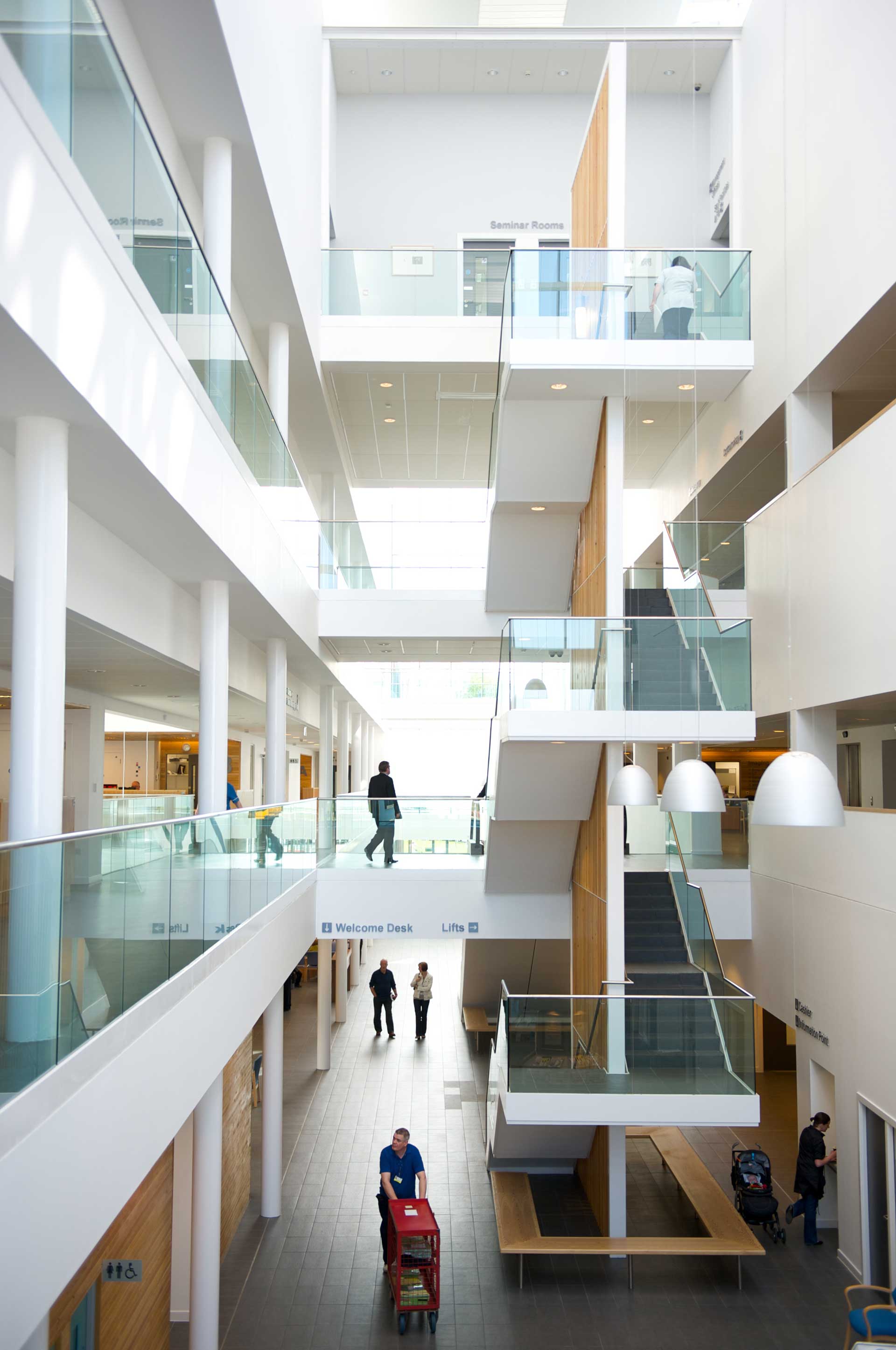
- the atrium became the beating heart of the hospital
- hospitals from across Scotland can learn from future design implications to consider
- including key stakeholders during construction benefited the entire project
Meeting the needs of a variety of services and a high number of patients
The building had to process people quickly and efficiently. To achieve this, it had to be organised around the patient experience and accommodate a variety of services. It had to:
- lower waiting times by reducing the time taken to transfer between different areas of the facility
- ensure that patients arrive in the right place at the right time with the minimum levels of stress and anxiety
- facilitate the needs of 20 different services such as diagnostics, elective surgery, emergency care, Minor Injuries Unit (MIU), mental health units and out-of-hours GP services
- accommodating for up to 2000 patients and 800 staff per day
- respond to the challenge of designing a hospital that recognised and prioritised human needs
Working with multiple stakeholders for the design process
The significant time spent with clinical groups at this stage, including colleagues in primary care and the ambulance service, developed a collaborative spirit around the project and a clarity of vision.
Part of the design brief included:
- redesigning clinal pathways by understanding the relationships between outpatient services, diagnostics, and laboratories
- understanding how surgical services might operate safely away from inpatient and emergency facilities
- plans showing the relationship that had to facilitate between the 20 different services
A health facility that places its patient at the heart of its design
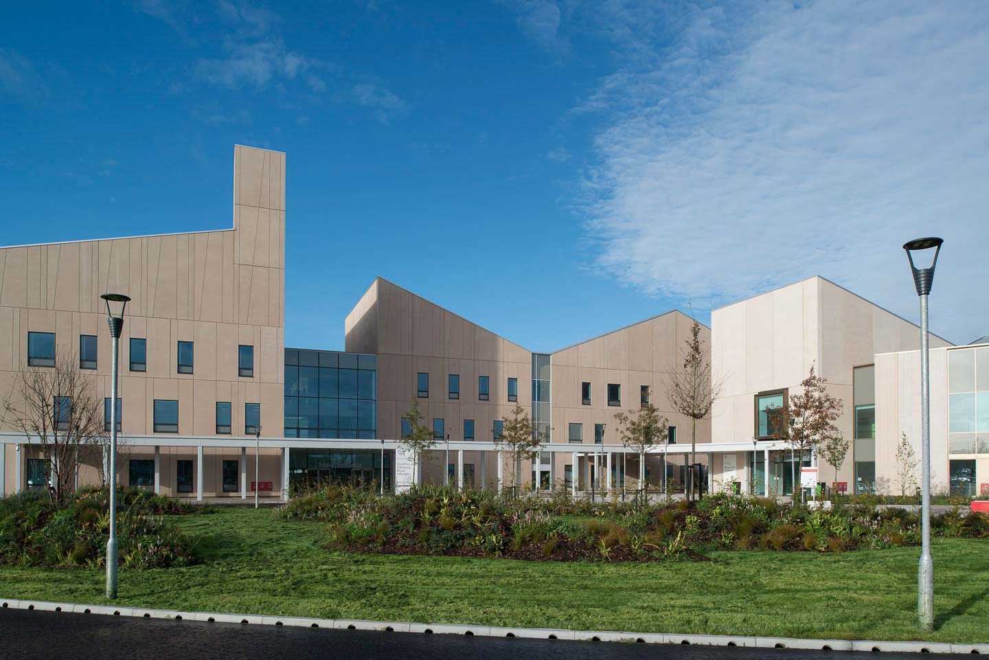
Reiach & Hall’s design proposal used the original design developed by the Public Sector Comparator (PSC) as its starting point, making changes that enabled the hospital to place its patient and the heart of its design.
Some of the design elements include:
- an entrance that feeds directly into a central atrium and provides immediate access to the outpatient clinics, day surgery and diagnostics
- splitting clinical accommodation into two types
- placing highly serviced areas such as surgery and radiotherapy in a deep-plan four-storey block towards the north of the atrium
- positioning the outpatient consulting areas and MIU within a three-storey block to the south
- arranging the smaller scale cellular accommodation in a series of narrow plan ‘loops’ around the courtyard to provide daylight and views
- direct and discrete access to the MIU through a raised bank towards the south of the facility (also acts as a visual buffer to the adjacent mental health unit)
“It’s a stunning hospital… There is no reason why patients shouldn’t feel positive when they go there. It’s not dark or dingy. It is lovely and light. All hospitals should be designed like the Stobhill site in the future.”
The atrium as the beating heart of the hospital
The overall experience for patients and visitors arriving and moving around the hospital is one of ease. In fact, it does not feel like a hospital and that is its charm.
“…it doesn’t feel like a hospital, and patients therefore do not feel like they’re patients or that they’re unwell. We are promoting health and wellbeing in this building just from the very fact that it is the building that it is.” – Jackie Wilson, Nurse and Outpatient Services Manager
The atrium is large enough to dissipate sound. Despite the escalators and the number of people moving through or chatting in waiting areas, it is a relaxed place.
“In fact, the acoustics are so good there are singing and piano performances in the atrium which the patients and staff really appreciate.”
“It’s also wonderfully light. Even on the dull February day of our visit most of the lights in the atrium were off. But due to the simple clean design, good orientation and positioning of glazing and the use of light, reflective materials it felt bright and welcoming.” – Margaret Campbell, Commissioning Manager, former OT
The visibility of the different services from the atrium also allowed visitors and staff to navigate through the hospital easily.

The smallest of changes can make the biggest impact
Despite the positive response from its staff post-opening, there were some details picked up that in a more ‘everyday’ hospital may have gone unnoticed. Some of these details included:
- looking into more doors on hold-open devices as the fire doors were heavy, creating a repeated barrier when moving around and psychological bar for communications with other teams
- enhancing staff facilities, as the building becomes a stand-alone facility, staff’s personal needs such as banking, food, and refreshments, must be entirely met within the facility
- increasing the size of the café on the top floor as staff were bringing food down into the main atrium to eat
- creating a standard and common size front of house space, allowing services to swap areas easily in the future.
- reviewing and testing unintended consequences of the Disabilities Discrimination Act (DDA) ‘compliance’, such as low mirrors opposite endoscopy exam benches, which can be off-putting as patients could view the procedures and staff members' expressions
- reviewing innovative technology used to reduce construction times which resulted in leaks
- inspecting mechanical ventilation systems as the current system has little back-up when systems fail; this included a failure to cool the building down in the summer (in areas with no windows) and freezing in the winter when heating failed (when atrium vents were stuck open)
- clearer location of lifts
- lack of visibility of the MIU upon arrival on-site can cause confusion and additional stress
Including key stakeholders during construction
Starting with the clinical redesign, staff and stakeholders were involved in all aspects of the project, which created a joined-up approach. This also included the tradesmen on the site.
Taking in groups of staff on-site on a regular basis during the construction provided practical benefits. It allowed detailed issues to be addressed timeously and helped the tradesmen form a link between what they were building and the service and people it was for.
It also developed a sense of ownership for the hospital staff and by the time they moved in it was “our hospital”.
The confidence, drive and clarity of vision on both the client and design team sides shine through in a world-beating hospital which truly embodies NHS Scotland’s vision of “an estate designed with a level of care and thought that conveys respect”.
Header image credit: Andy McGregor
Further examples of healthcare facilities
We have more case studies on healthcare facilities available on our website. These case studies cover a broad range of projects ranging from hospitals to dental practices.


